Visual Brand Refresh for a Cloud Backup Company
Time for a Makeover? That feeling when your look and your identity need to get synced up.
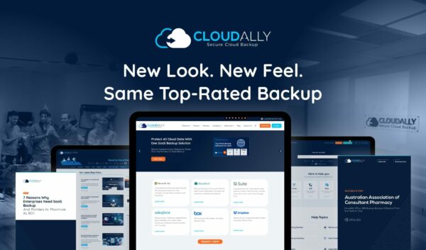
To stay relevant and authentic, every organization has to reassess its brand elements – infusing the vision of tomorrow while staying true to its core identity. Here’s a walkthrough of CloudAlly’s visual refresh – a Visual Brand Refresh for a Cloud Backup Company, updating our visual brand identity to more accurately represent our product positioning, business segment, and value proposition.
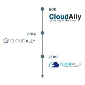
2011: The Inception
Looking back to our inception back in 2011. We began as a small company with a team of cloud technology veterans. We recognized a gaping hole in organizational cybersecurity – companies were moving to the cloud by the hordes, with a prevalent misconception that their data was secure on the cloud. Which it is.
Except if you count malware, hackers, mistaken deletions, intentional corruption, bad actors, outages, sync errors…a whole roster of common causes of data loss. The solution? A robust and secure SaaS backup solution.
We pioneered the first SaaS backup solution for G Suite (Google Apps). We wanted our visual identity to emphasize our ease of use, our intuitive UI, and the fact that we’re your cloud data protection buddies – we always have your (back)up. Hence “Cloud Ally – You’re Ally in the Cloud”
2014: Three Year Refresh
We know that our customer’s data is only as safe as its backup. And that is why we’ve been fanatical about security from the get-go and have built it into the DNA of our products. We store all backups on Amazon S3 storage with AES-256 bit encryption. We were amongst the first backup solution to get the ISO 27001 certification.
Realizing that a key customer benefit of backup was facilitating their compliance with data protection laws, we became HIPAA compliant, supported 2FA/MFA authentication, and expanded the locations of our data centers. This was to ensure we and our customers were audit-ready and compliant with the GDPR, HIPAA, and other regulatory laws.
It was about secure backup all the way and we wanted to highlight our stringent security credentials in our logo. Hence we introduced a shield, demonstrating our strong position on security.
2020: The Now
Since then we’ve grown to a 50+ employee size company with a global customer list of 5,000+, with over 1 million users.
Our suite of solutions has also evolved into a holistic one, comprehensively supporting backup of all major SaaS platforms – Office 365, SharePoint/OneDrive, G Suite (Google Apps), Salesforce, Box, and Dropbox. We have data centers in the USA, Ireland, Canada, Australia, and shortly will be expanding to the UK and Germany.
We’ve remained an independent company, with the same founding members, and an exceptional globally distributed customer support team – so we can be where our customers are. Most importantly we have stayed true to our mission of providing innovative data protection solutions that delight our customers.
The Analysis of A Visual Brand Refresh
Phase 1: Discovery and Analysis
A crucial, but undervalued step is taking stock of the company’s history, USP, mission, future goals, customer needs, and competitive analysis. This is essential in presenting an authentic vision of the brand; one that is consistent and credible.
As a part of this phase, we had deep-dive sessions with the management team, conducted surveys with our clients, and did a comprehensive competitor analysis. This reinforced our mission statement, meta-level product roadmap, vision, and goals, readying us for phase two – translating them visually.
Phase 2: Mapping Learnings to Elements
In this phase, we mapped the learnings from phase one to our brand pillars, taglines, logos, colors, fonts, content strategy, and overall digital (website and social) presence.
For instance, our objective with the new visual refresh was to continue to reflect our mission – our customer’s data protection partner. Hence we’ve visually emphasized ALLY in our brand color – navy blue. Our tag line has been modified to ‘Secure Cloud Backup‘, to explicitly call out our continued emphasis on security.
Phase 3: Content Audit
For the brand refresh to be all-inclusive, comprehensive, the visual elements and tone of voice have to be reinforced across every single touchpoint.
We did an audit of all our content including every artifact that our organization uses to communicate with both our external and internal audiences.
Thus apart from the content of the web pages, we did an inventory of our blogs, internal sales documents, client presentations, videos, customer stories, product walkthrough videos, brochures, FAQs, knowledge base articles, email signatures, webinar recordings, social profiles, and more.
Phase 4: The Rollout
Next came planning the rollout. Our customers are our highest priority, and thus we kickstarted the refresh with our Customer Support Hub – our dedicated customer space that houses our ticket and chat systems, knowledge base, and video tutorials.
This was followed by our updating our website with a new look and feel, and revamping our blog with helpful insights from our company’s thought leaders.
We then worked through all the artifacts and channels that were part of our audit. This included modernizing our product UI and remodeling our office interiors. We have a refreshing and consistent tone of voice with all our marketing materials synced with the new content strategy and visual design.
We put in a lot of effort into this refresh in order to better reflect our value proposition. Our brand visually reflects our commitment to provide best-in-class, secure cloud backup with always-on customer support. We look forward to hearing your feedback in the comments, on our Twitter, or Facebook company page.
P.S. For our partners in backup we’ve placed the new logo on our media page, ready for download.


